Geosay
Geosay is a local information Google Map for finding out what people are saying about different locations on foursquare, Twitter and Wikipedia.
To use the map just enter a location and you can see all the results directly on the Google Map. The results are also listed in the map sidebar, ordered by distance.
It is easy to create a marker for Geosay. Just add the hashtag #geosay to any geolocated tweet and it will be stored in the Geosay database and appear on the map. Geosay has a mobile version of the map. Just go to http://geosay.com in the browser of your mobile phone and you can find local tips wherever you happen to be.
Wednesday, August 18, 2010
A Big Thank You to our Growing Community of Bike Map Contributors
When we added U.S. biking directions to Google Maps back in March, we were eager to see the response from the cycling community. Through our partnership with the Rails-to-Trails Conservancy, we had detailed bike lane and trail information for 150 cities; and for the rest of the country, we recommended routes based on other data such as the size of the road, speed of traffic and hill steepness. On one hand, it would’ve been ideal for our directions feature to know about all the bike lanes and trails in the country. But on the other hand, we were aware that biking directions were one of our most-requested features and we wanted to provide information for bicycling fans as soon as possible.
So rather than wait, we decided to launch biking directions in “beta” and ask our community of bicycle-bound users for their help improving our bike maps. Through our “Report a problem” tool, any user can send us corrections or recommend improvements, and receive notifications from Google when their report has been resolved. We always knew the cycling community would be a passionate bunch, but the response to both our biking directions feature and our call to join in the effort to improve our bike maps has surpassed our happiest expectations.
More than 10,000 people have submitted about 25,000 suggestions for improvements to our bike maps. With their help, we’ve added bike lane and trail data for an additional 80 cities since our initial launch. This is an exciting and humbling response from the Google Maps community. It’s like having 10,000 new members of our bike maps team, contributing their time and energy to make Google Maps more useful for everyone.
These contributors have impacted biking directions across the nation - in small and large ways. Here are some examples of suggestions we’ve received:
This is how we’ll build a great cycling map: Bit by bit, getting better with every tip and suggestion that users share about the lanes and trails they’ve ridden.
We want to say “Thank you!” to all those who’ve answered our call for bike map contributions. Clearly our users are passionate about helping to make our maps better, so we’re working hard to make the improvement process even easier and to speed up the processing time for user contributions.
In the meantime, happy biking! Just remember that our biking directions are still in beta, and to always use your judgement - don’t ride down any road that makes you uncomfortable. And if we’ve recommended a road that shouldn’t be used by the average bicyclist, let us know!
So rather than wait, we decided to launch biking directions in “beta” and ask our community of bicycle-bound users for their help improving our bike maps. Through our “Report a problem” tool, any user can send us corrections or recommend improvements, and receive notifications from Google when their report has been resolved. We always knew the cycling community would be a passionate bunch, but the response to both our biking directions feature and our call to join in the effort to improve our bike maps has surpassed our happiest expectations.
More than 10,000 people have submitted about 25,000 suggestions for improvements to our bike maps. With their help, we’ve added bike lane and trail data for an additional 80 cities since our initial launch. This is an exciting and humbling response from the Google Maps community. It’s like having 10,000 new members of our bike maps team, contributing their time and energy to make Google Maps more useful for everyone.
These contributors have impacted biking directions across the nation - in small and large ways. Here are some examples of suggestions we’ve received:
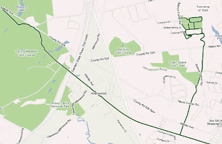
- One user simply pointed out to us, “Wall Township Bike path - http://www.wallrec.com/bicycling.htm.” Our response to that short and sweet message?Here it is:
- Some else sent a note saying, “CSUS - there has been a bike/foot traffic tunnel that connects elvas ave to College town dr for about 6 years. it is located between 64 & 65 st.” Well, that’s handy to know! Done:
- And yet another user shared, “Cycle/hiking path continues to the East across Switzer and connects with the path that is currently shown on google maps ~2.5 miles to the ENE at 130th and Metcalf Ave. Details on Overland Park website http://www.opkansas.org/Resource_/PageResource/Maps-And-Stats/Maps/Adobe-Acrobat-PDF-Maps/bike_route_plan.pdf Thanks.” Awesome! Overland Park is nowlooking pretty good for cyclists:
This is how we’ll build a great cycling map: Bit by bit, getting better with every tip and suggestion that users share about the lanes and trails they’ve ridden.
We want to say “Thank you!” to all those who’ve answered our call for bike map contributions. Clearly our users are passionate about helping to make our maps better, so we’re working hard to make the improvement process even easier and to speed up the processing time for user contributions.
In the meantime, happy biking! Just remember that our biking directions are still in beta, and to always use your judgement - don’t ride down any road that makes you uncomfortable. And if we’ve recommended a road that shouldn’t be used by the average bicyclist, let us know!
Google Maps - Your Personal Travel Guide
Nile Guide
Nile Guide is a great trip planner and personal travel guide. The site lets you explore areas you might like to visit for hotels, restaurants and other points of interest and create your own personalised travel itinerary.
To start planning your trip with Nile Guide you just need to enter your destination. Nile Guide will then give you an overview of your destination and allow you to view Hotels, Things to Do, Restaurants, Nightlife and Events. The points of interest are even displayed on a Google Map.
To add a place you want to visit you just need to click on the 'Add to List' link and it will be added to your 'My Guide'. Once you have added a number of destinations to your travel itinerary you can then organise your guide. You can drag and drop your different picks on to different days of your trip and you can view the locations of your choices on a Google Map.
When you have completed your personal travel guide if you press 'Print my guide to go' Nile Guide will create a printable version of your very own travel itinerary.
Boat race replays in Google Earth
We've talked before about how you can use Google Earth to record and show GPS tracks from various events, such as off-road running races and biking across Poland. SFGate has a great story about using Google Earth to show realistic replays from a sailboat race.
Using the new "track" feature in Google Earth 5.2, they import the GPS data into Google Earth to make it work. They also took the time to model the area with 3D boats and buoys (available in the 3D Warehouse) to make it more realistic.
Google Earth product manager Peter Birch is referenced numerous times in the article, because he often races on a Catalina sailboat and Google Earth is obviously a huge part of his life. He's quoted as saying that the track technology "is something we've been working on for a long time", and I wouldn't be surprised if Birch used data from races like this to help test the features as they were being developed.
Being able to watch replays of the race from any angle gives the teams a great way to understand (and hopefully correct) their mistakes before the next race. Check out the SF Gate article for the full story.
To learn more about creating tracks, this section of Google Earth Help has a lot of great information.
US Dummy Election Map
Survey Mapper
Survey Mapper's Google Maps based polling / survey tool has now added support for US States and Zip Codes. To celebrate this new coverage Survey Mapper has created a survey to ask "If an Election in the USA Was Called Today Who Would You Vote For?".
Using Survey mapper you can quickly set up an online poll and view the results in real time on a Google Map. The service is a great way to carry out a survey and to view the results geographically. For example, the map below shows the results of a poll into how happy people are. It looks like Brazilians are having the most fun and that Russians are quite depressed.
Property Hotspots on Google Maps
Trulia: National Home Prices Heat Map
Real Estate website Trulia provides a weekly heat map of home prices in the United States.
Trulia uses Google Maps to give users a quick view of the average listing price in every U.S. state. The tabs at the top of the map allow the user to switch between heat maps of the average listing price, the median sales price and Trulia popularity.
If you click on any of the states you can view the total number of homes for sale in the state and the average listing price.
Mouseprice
Mouseprice has created a nice heat map of property prices in England and Wales. Using the map it is possible to find the locations with the cheapest and the most expensive real estate.
Users of the map can view heat maps for average values or just the prices of new builds. You can also view heat maps showing the areas with the least and most 1 year, 5 year and 10 year growth. You can even view a heat map of crime in England and Wales.
The map includes a transparency control for the heat map layers. It is therefore possible to adjust the layers to view the locations beneath in detail.
Cenove Mapy
Czech real estate company, Bezrealitky.cz, have produced this Google Maps mashup to show current real estate prices in the Czech Republic. The site uses a heat map to show the relative prices of properties at 1m².
French Property Prices Map
This Google Maps mashup from MeilleursAgents.com shows the relative price of properties in France. A heat map, based on the latest month's property prices from MeilleursAgents.com, shows where in France you can buy the most expensive and cheapest properties.
Rapping Google Maps
The Rap Map
Rap Genius is using Google Maps in its ongoing mission to help explain rap lyrics. Lyrics on Rap Genius include orange highlights that when clicked open up explanations. Now, when those lyrics refer to a location, you can view the referenced place on Google Maps.
If you click the 'Map it!" link in the explanation box the Rap Map opens centred on the location. Every marker on the Rap Map is linked to a different rap song. If you click on a marker you can read the referenced lyric, a brief explanation and a street level photograph of the location.
The map sidebar includes links to all the map markers. The links are organised by city so you can quickly find all the rap lyrics about a particular location.
RapMaps
"You are now about to witness the strength of street knowledge."
- Straight Outta Compton, NWA
Google Maps Street View allows anyone to explore any hood anywhere. Rap music seems the most geographically aware of music forms. So what better idea than to map rap songs so listeners can virtually explore the locations being rapped about on Google Maps?
RapMaps does it exactly that. It is a mashup of Google Maps and YouTube rap videos. The videos are geo-tagged by their location. So when Kam sings Watts Riot you can now explore Watts on the map in Street View at the same time as watching the video.
Visualise Airport Delays with Google Maps
Flightstats - Airport Delays Map
Flightstats has featured a real time Flight Tracker Google Map on its website for a number years. It now also has a Google Maps based Airport Delays map.
The flight tracker works much the same as an in-flight tracker you'd see on-board an aircraft. To use the map you just need to enter a carrier flight number and departure date. The map will then display the flight's track on a Google Map with essential real-time information such as the flight status and scheduled arrival time.
Flightstats Airport Delays map gives you a quick overview of likely delays at major airports around the world. The airport markers on the map are colour-coded to indicate the severity of current delays. A green marker shows that the airport is running without major delays and a red marker with a black dot signals that the airport is experiencing excessive delays.
It is possible to click on any airport to get a more detailed view of current delays. It is also possible to view a weather radar overlay on the map (which I guess just might give you a clue as to why a particular airport is experiencing delays).
Google Map of the Month
We are only halfway through August but I have already stumbled upon the Google Maps Mashup of the Month. Dimensions is a great website that lets you compare your home and neighbourhood to other locations and events in history.
Warning: You are going to be hooked!
Ifitweremyhome.com
Recently there has been a spate of Google Maps that allow you to compare the size of the Gulf oil spill with places you know. Ifitweremyhome.com and Paul Rademacher's How Big is the Gulf of Mexico Oil Spill? both allowed you to place an overlay of the oil spill over a location you know well. The ability to compare the spill to a place that you know really helps to convey the sheer size of the Gulf oil disaster.
Ifitweremyhome.com also has a great country comparison tool that allows you to compare the size of different countries by placing an overlay in the shape of one country over another. Users can compare the size of any country with any other country and can even view a number of economic and lifestyle comparisons of the two compared countries.
So, for example, in the screenshot above the shape of the UK is laid on top of the USA. The map is accompanied with some interesting facts that tell you that,
"If the United Kingdom were your home instead of the United States you would make 24.14% less money and live 0.92 years longer but that you would experience 24.44% less of a class divide, consume 55.61% less oil, have a 22.15% lesser chance of dying in infancy and have a 13.98% better chance at being employed."
BBC Dimensions
This prototype website for the BBC is taking the map based comparison idea a whole lot further. Dimensions takes a larger number of important places, events and things, and overlays them onto a Google Map of where you are.
It is hard to know where to begin with this site as there are just so many comparisons that you can make. The screenshot above shows the Great Wall of China, only as if it was in the USA. Alternatively you could compare the moon to your home state or you could view the Twin Towers footprint placed over your house or see how much of your neighborhood would be overrun if Burning Man was held in your garden.
There are so many comparisons that you can view on Dimensions that you should be prepared to lose a substantial part of your day to this website. I can guarantee that Dimensions is going to have you hooked.
Oxfam: Pakistan Floods
Whilst we are on the subject of comparison maps the charity Oxfam are using a screenshot of the Pakistan floods overlaid on a Google Map of the UK to help convey the scale of this emerging disaster.
Oxfam are using the image as part of a campaign to encourage Europeans to email the president of the European Commission to ask him to do more to help those affected. The image shows that if the flood were in Europe it would stretch from Aberdeen in Scotland to Paris.
Public Spending on Google Maps
The Telegraph: Council Website Spending
British newspaper The Telegraph has created a Google Map to display how much local councils have spent on their websites.
The paper rather disingenuously claims that "councils are spending millions on redesigns of their websites despite facing the biggest funding cuts in their history". In fact the data is from 2008/9, before the UK government started the funding cuts and actually shows only one council spending over £1 million on a website redesign.
The map has three datasets that can be viewed: External Spending 2008/9, Redesign Cost, Most Recent and External Spending per Individual. The map places circular overlays over each town. The size of the overlay is in proportion to the size of the spend.
New Update to Google Earth: Version 5.2.1.1547
Google has just pushed out version 5.2.1.1547, replacing version 5.2.1.1329 for most people. The "check for updates" feature doesn't seem to be finding it yet, but if you download Earth from their servers (earth.google.com), you'll get the new version.
As far as I can tell, there aren't any official release notes available yet. However, you can find a few tidbits about the release in this thread in the KML Developer Support group.
Based on that information, it seems that this release fixes a variety of bugs in regards to 3D/polygon handling. Grab the update here and if you notice any other changes, please leave a comment and let us know!
Google Earth Enterprise 4.0 released
Called "The ultimate geo mashup platform", Google Earth Enterprise 4.0 has been released. You may be familiar with Google Earth Enterprise, as it has been used for projects such as Louisiana Earth.
Among the new features in GEE 4.0 is one called the "Portable Earth System". In many uses of GEE, people need access to their information in places where internet connectivity is limited or simply non-existent. Here is how that feature works.
Other enhancements in GEE 4.0 include Mobile Access via the Google Earth client on Android,full support for Google Earth 5.2 and the latest version of the Google Earth Plug-in.
For more on GEE 4.0, you can check out the full write-up on the Google LatLong Blog.
Rapping Google Maps
The Rap Map
Rap Genius is using Google Maps in its ongoing mission to help explain rap lyrics. Lyrics on Rap Genius include orange highlights that when clicked open up explanations. Now, when those lyrics refer to a location, you can view the referenced place on Google Maps.
If you click the 'Map it!" link in the explanation box the Rap Map opens centred on the location. Every marker on the Rap Map is linked to a different rap song. If you click on a marker you can read the referenced lyric, a brief explanation and a street level photograph of the location.
The map sidebar includes links to all the map markers. The links are organised by city so you can quickly find all the rap lyrics about a particular location.
RapMaps
"You are now about to witness the strength of street knowledge."
- Straight Outta Compton, NWA
Google Maps Street View allows anyone to explore any hood anywhere. Rap music seems the most geographically aware of music forms. So what better idea than to map rap songs so listeners can virtually explore the locations being rapped about on Google Maps?
RapMaps does it exactly that. It is a mashup of Google Maps and YouTube rap videos. The videos are geo-tagged by their location. So when Kam sings Watts Riot you can now explore Watts on the map in Street View at the same time as watching the video.
Rap Genius is using Google Maps in its ongoing mission to help explain rap lyrics. Lyrics on Rap Genius include orange highlights that when clicked open up explanations. Now, when those lyrics refer to a location, you can view the referenced place on Google Maps.
If you click the 'Map it!" link in the explanation box the Rap Map opens centred on the location. Every marker on the Rap Map is linked to a different rap song. If you click on a marker you can read the referenced lyric, a brief explanation and a street level photograph of the location.
The map sidebar includes links to all the map markers. The links are organised by city so you can quickly find all the rap lyrics about a particular location.
RapMaps
"You are now about to witness the strength of street knowledge."
- Straight Outta Compton, NWA
Google Maps Street View allows anyone to explore any hood anywhere. Rap music seems the most geographically aware of music forms. So what better idea than to map rap songs so listeners can virtually explore the locations being rapped about on Google Maps?
RapMaps does it exactly that. It is a mashup of Google Maps and YouTube rap videos. The videos are geo-tagged by their location. So when Kam sings Watts Riot you can now explore Watts on the map in Street View at the same time as watching the video.
Subscribe to:
Posts (Atom)