Friday, July 23, 2010

The Best San Francisco Marathon Map Ever

Going the Distance - The Wall Street Journal

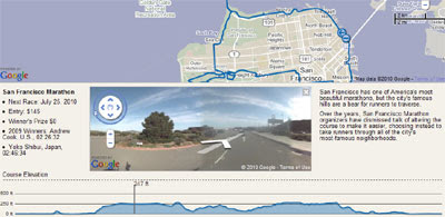
The Wall Street Journal have created a Google Map of this Sunday's San Francisco Marathon. The map includes the route, an elevations chart and Street Views of the route.

This in itself would be very impressive but the Walls Street Journal wasn't satisfied so went ahead and mapped the Boston Marathon route, the New York Marathon and the Chicago Marathon as well. Each of them also come with elevation charts and Street View.

My favourite feature of the Wall Street Journals maps is the superb integration between the elevation chart and Street View. If you hover your mouse along the elevation chart the Street View will update to show the respective view. Very cool.

Also See

Skyhook Experience
Skyhook Wireless have created a Google Map of San Francisco to show where people congregate during different times of the day. The map has been created for this Sunday's San Francisco marathon.

London Marathon Street View

My own London Marathon Street View map now looks very tame in comparison. Don't worry though when I get a spare hour or two I'm going to take up the challenge laid down by the WSJ.

Find a Food Truck with Google Maps

Bistro Chaser

Bistro Chaser provides a real time tracking Google Map for food trucks in Los Angeles, Orange County and New York. The map uses Twitter messages from the food trucks themselves to provide updates of their current location.

If you select the Schedule section of Bistro Chaser you can select a city and a specific food truck. You can then view the schedule for the selected food truck. The different locations that the truck is planning to visit are shown on the map and listed in the map side panel.

Also See

  • Tweat It - Google Map of food vendors in New York
  • truXmap - real-time location map of food trucks in Los Angeles

Heading west for a bit


I'll be traveling through Xinjiang these next few weeks — to Ürümqi, then by train to Kashgar, or at least what's left of it before the old town is completely razed. From there, I hope to make it to Tushuk Tash, the world's tallest natural arch — you can stick the Empire State building under it. With some luck, I'll bring back 360-degree panoramas of all these places.
Considering that all of Xinjiang was completely without internet most of the past year (there were some troubles) I likely won't be online all that often. Needless to say, if something happens to Google Earth in the meantime, you won't read about it here. See you in a few weeks.

ESRI Shapefile - HTML5 Viewer

ESRI Shapefile - HTML5 Viewer

This is a neat way to display ESRI Shapefiles online without using any GIS software.
(Note: Not compatible with Internet Explorer)
Shapefile HTML Viewer loaded
Two shapefiles are displayed here cities of the world and associated text along with Countries of the World with a line style and  polygon fill style.

Notes: Keep shapefiles as small as possible, smaller shapefiles returns faster display results.
Faster than ArcIMS in some cases. But depends on the hosting server.


Shapefile HTML Viewer Mapperz
Mapperz Version, styles and fills changed, though seems slower, compare the difference.

The two files required are the .shp (geometry in lat/lng WGS84) and the .dbf (Table)
var map = new Map('map', [
    // country shapes
    new Layer('http://mapperz.110mb.com/shape/110m_admin_0_countries', 
{ fillStyle: '#76e97c', strokeStyle: '#18841D', lineWidth: '0.5' }),
    // dots for cities
    new Layer('http://mapperz.110mb.com/shape/110m_populated_places',
 { fillStyle: '#8A2BE2', /*textHalo: '3', textStroke: 'white',*/ textFill: 'rgba(255, 0, 0, 0.6)', 
textProp: 'Name', font: 'bold 9px sans-serif' })

  ]);
  Links [source code:]

More complex version involves 10 shapefile layers.

Augmented Reality Instant Messaging

TagWhat

The last thing the world needs is another location sharing mobile application. However Tagwhat does have a unique selling point. TagWhat isn't just another location sharing application, it is an augmented reality location sharing application.

If you download the Android or iPhone TagWhat application you can then use your mobile phone to share your location with the rest of the world. Your message can then be viewed by other TagWhat mobile users in augmented reality in their phone screens.

As well as appearing in augmented reality your message will appear on the TagWhat real-time animated map of location check-ins. The TagWhat home page features a prominent Google Map that animates through the latest messages sent by TagWhat members.

Interactive multi-layered Google Earth map of 4 degree temp rise


Regardless of your views on climate change, Google Earth has proven to be simply the perfect tool to lay out the various scenarios that we are facing. In the past, we've shown you items such as the Climate Change Tour of Cold Places and various tools related to the COP15 conference in Copenhagen last year.
The latest tool to be released comes from the UK Government, with data from the FCO (British Foreign and Commonwealth Office) and the DECC (Department of Energy and Climate Change), showing the potential impact of a 4 degree rise in global temperature. They believe that global warming must be contained to 2 degrees Celsius, which this project illustrates.
fco-map.jpg
Here's what they have to say about it:
On 14th July, the FCO and DECC launched an interactive map showing some of the possible impacts of a global temperature rise of 4 degrees Celsius above pre-industrial times. It underlines why the UK Government and other countries believe we must keep global warming to 2 degrees Celsius. The map includes videos from the contributing scientists, led by the Met Office Hadley Centre, talking about their research. It also includes examples of what the FCO and British Council are doing to build understanding globally of the urgent need for all countries to accelerate the transition to a low carbon economy.
To check it out, you can visit www.fco.gov.uk/4degrees and view it using the Google Earth Plug-in or by downloading their KML file to your computer.

Portugal's Cheapest Gas on Google Maps

Mais Gasolina

This Google Maps mashup allows you to find the price of gas at Portugal's gas stations.

The initial view shows 120 gas stations but as you zoom in on a specific area all the gas stations will load. You can also search for gas stations around a location by using the map search box.

To find out the various gas prices at a station just click on its map marker.

Finding Cheap Gas

Exploring the Alleghenies with Google Maps

The Alleghenies Interactive Map

The Alleghenies are home to some of the best fishing in the eastern USA, countless miles of hiking trails, rushing white-water rivers and peaceful lakes. In fact there are so many outdoor activities possible in the Alleghenies it is difficult to know where to begin. That's where this Google Maps guide to the Alleghenies great outdoors comes in.

The Alleghenies Interactive Map helps you find ATV & dirt biking trials, bird watching locations, cycling on road, hiking trails, motor touring and mountain biking trails. For each mapped activity users can share their comments and photos of the location.

Friday Fun with Google Maps

Mapping Out the Google Maps Office

The Google Geo team's new office in the Googleplex has been decorated by artist Christoph Niemann. Christoph's work is inspired by Google Maps, as you can see from the screenshot above. The artist's work was also recently featured in the New York Times.

Street View Lens Flares

I know that your life has been missing a blog dedicated to Street View images that feature lens flares. Thankfully your life can now be complete as StreetViewLensFlare has been released and yes it is a blog dedicated to Street View lens flares.

Google Maps API for Flash at Progressive Insurance Automotive X PRIZE

The following is a guest blog post by Kevin MacDonald of ThinkWrap Solutions

We're coming to you live from the Michigan International Speedway, where the Progressive Insurance Automotive X PRIZE (PIAXP) competition is underway.

This competition will award $10 million in prizes to the teams that win a rigorous stage competition for clean, production-capable vehicles that exceed 100 MPG energy equivalent (MPGe).

Vehicles are equipped with telemetry sensors and a GPS that together capture the following key performance indicators (KPI): fuel consumption, CO2 emissions, carbon footprint, speed, distance travelled and location.

ThinkWrap Solutions partnered with PIAXP to build a web experience that lets you monitor these KPI -- second-by-second -- from the comfort of your web browser.

The web-based experience is centered around a dashboard, a Flash application that embeds a number of telemetry gadgets, each responsible for the display of one KPI.

A Google Map is central to this experience, which uses a combination of location and horizontal dilution of precision (HDOP) to show the vehicle's movement around the track.

It's quite a novelty to be present at the Speedway, to watch the vehicle's icon round a turn on the map -- and then look away from the browser and to the track to see the actual vehicle approach and pass by.

To enjoy this experience, visit the official website, to meet the teams and their vehicles. (Check this video to see the map and telemetry data in action.)

Race times and vehicles are updated daily and posted at this page. Click on one of the vehicle photos on this page to view its telemetry data, and track its progress as it races around the racetrack, live on a Google Map!

Challenges

Our first challenge was to make sure that the map accurately tracks the vehicle's movement around the track. Although a GPS reports latitude and longitude coordinates to a precision of a few feet, availability of GPS satellite signals and atmospheric conditions can affect coordinate accuracy. Without concern for this accuracy, the map might show a vehicle hopping around the track, up on to the stands, over the stands and into a nearby farmers field!

We all know that GPS coordinates include latitude and longitude. GPS also measure the accuracy of these horizontal coordinates through a metric called Horizontal Dilution of Precision (HDOP) which for us, varies from 1 to 50 (1 is best and 50 is worst).

The map plots the coordinates on the map only if HDOP is 3 or less. If it's greater, the vehicle icon does not move. After 30 seconds, the icon is removed from the map.

Another challenge was to economically satisfy the clients' real-time demand for data, especially under conditions where a media blitz attracts tens or hundreds of thousands of visitors. Data flow -- from vehicle to website -- involves many intermediate stages: each vehicle independently broadcasts its KPI through a Sprint cellular connection, second-by-second, to a central server. Every second, this server batches KPI records across all reporting vehicles, and pushes, as a POST request, through a REST interface to a Java-based server running on Google App Engine. This server then caches the data in memory, and stores a copy in Datastore.

Client applications, which display the dashboard, poll for new data from Google App Engine through another REST interface. If the request hit the servlet that originally received the KPI from the vehicles, the request is serviced from a cache. Otherwise, the servlet needs to query the Datastore, cache the data and then reply to the client.

The client receives a batch of KPI data for the last 10 or so seconds, which it plays back through the dashboard, one record per second. When the client's buffer is nearly empty, it requests another batch of new data and continues, rinse-cycle-repeat.

Although the clients play back KPI data from a few seconds ago, collectively, they place much less burden on the server, and maintain sufficient buffer so as to minimize interruptions when updating the map.

We built our map on the Google Maps API for Flash platform, primarily due to the maturity of its software development kit (Flex Builder), relative ease of development, and cross-browser support.

Enjoy!

Newly discovered crater is one of Earth's youngest impacts


Researchers scouring Google Earth for impact craters have discovered a new one in Egypt, National Geographic reports. Dubbed the Kamil Crater, it is small but very special, because it really is new, in geological terms — just a few thousand years old. So new, in fact, that the elements have not yet been able to erode the ejecta rays. On site, the researchers have been able to collect thousands of space rocks.
These findings were published just yesterday in the journal Science. The full text article requires a subscription, but the supporting online material does not. This material includes satellite images of the crater that contain coordinate information. So without further ado, here's the crater on Google Maps:
It's a real beauty, and it really is in the middle of nowhere. The imagery we see currently in Google Earth/Maps was collected on May 21, 2006.
[Update 0546 UTC: Some more crater links:
This page explains that the crater was first noticed in February 2009, and confirmed on-site in February 2010. Here's the official page for the crater, labeled Gebel Kamil, at the Meteorological Society. Some guy on Ebay is purporting to sell pieces of the ejecta found at the crater site. It sounds dubious (what's with the piaster notes?), but the page has a good aerial image of the crater:

(Click to enlarge)]