The Planning Department of the City of Amsterdam has created a number of interesting Google Maps, all of which can be found in the Interactieve Kaarten section of their website.The maps cover a range of subjects that will be of interest to local citizens, including housing, green spaces, climate and building use. For example the Woningwaarde Map plots the cost of housing in the city. Using a heat map overlay this map shows the average cost of housing throughout the city.Another interesting map is the Niet-Woonfuncties Map which shows the blueprint of all non-residential properties in the city. On the map each non-residential property is shaded to show whether the property is used for business, retail, leisure etc.There are a lot of other maps to explore on the site and all the data used in the maps is also available at Open GEO-Data.
 If you want to know where to vote then you should check out the Voter Information section of the Google Politics and Elections website. Here you can find a Polling Place Lookup tool that will tell where you should vote. If you enter your address your polling place will be shown on a small Google Map alongside the full postal address and the hours of opening. You can also click on the 'get directions' link to get the full directions from your home to your polling place.
 Justmap.it has created a crowd-sourced Google Map to help New Yorkers and Long Islanders find gas stations that are currently selling gas.The map shows the latest Twitter messages that include #NYCGAS. The messages can contain information about whether a gas station currently has gas and the length and duration of queues.
 Gas Station is a crowd-sourced Google Map showing operating gas stations and gas availability in New York and New Jersey.The map uses red markers to indicate gas stations that have sold out of gas and green markers to show those that are open. If you click on a marker you can get more information, where available, on likely waiting times and when gas might be available.To contribute information to the map post a Tweet with information about a gas station including '@IMSOCIO2012' in the message.The Google Crisis Map for NYC now includes a public transit map showing open subway lines, MTA replacement shuttle buses and road work and traffic advisories.The map also shows open and closed gas stations, pharmacies and restaurants. The map also includes a layer that shows open and closed food stores in New Jersey.
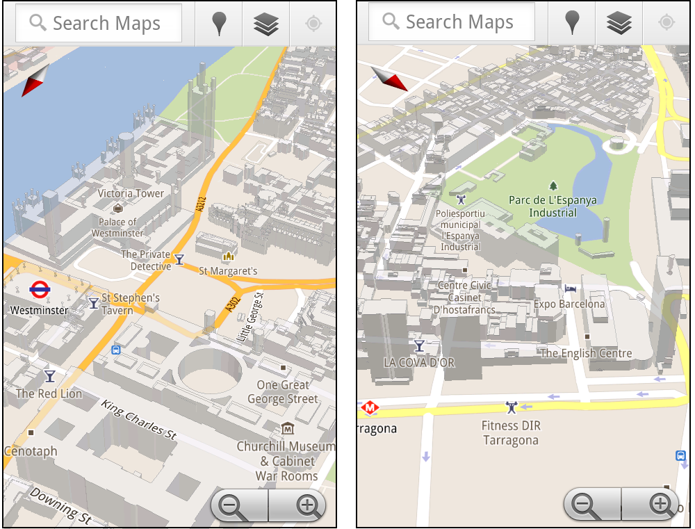
 Google have today added 3D buildings to Google Maps in more cities around the world. The new cities include London, Paris, Barcelona, Stockholm, Singapore, Lisbon, Boulder, and 11 major cities in South Africa.
In Google Maps the 3D buildings look pretty cool but they really only come to life on Google Maps for mobile. On Google Maps for mobile you can rotate, tilt, and zoom in and out on the buildings.

My guess is that at some point soon Google will look to implement the rotate and tilt views in Google Maps for the desktop.
The rotating buildings obviously make more sense on mobile maps where the orientation of the map can rotate to reflect your view. However this would be a great feature to be able to access via the Google Maps API. I could see this being a popular tool with many map developers.
Via: Google LatLong

Like many big cities Boston has very fluid neighborhood boundaries. Two people living next door to each other can often have very different ideas of which district they live in.
To try and clear up some of the confusion around Boston's boundaries Boston.com has created a Google Map that shows the different boundaries used by the Boston Redevelopment Authority, by the police, by the city and those determined by zip code.
Using the map you can drag the map pin around to view the different district boundaries at different locations.
Exploring Boston's Tangled Boundaries
Cooler Planet: Solar Energy Installation Map

Cooler Planet has created an animated time-line with Google Maps to show the progress of solar installations in California from 1999 through to 2011.
Using data from Go Solar California Statistics the map lets you view time-lines of 'total installs', 'total watts', 'watts per install' and 'total carbon saved'. It is fascinating using the map to view how solar power installations have blossomed in California over the last decade.
Google Maps now lets you search with 'descriptive terms'. Google describes 'descriptive terms as "the phrases which are most frequently used to describe ... places".
So, for example, if I want to find a pub that has quiz nights I can just type in 'quiz night' into the search bar on Google Maps. I will then be shown all the places that have 'quiz night' mentioned in reviews and other information gathered about the venue.

Other descriptive terms that I can imagine myself using a lot are 'great coffee', 'free wifi', 'free delivery' and 'live music'.
I'm sure I'll be using this new feature a lot!