Ujoolt is a smartphone app (Android & iPhone) that allows users to share short messages (140 characters or less), photos or short video clips with the rest of the world.Users can post a message, photo or video directly from their phone and their post will appear on the Ujoolt website's Google Map. All 'jolts' appear to be time-stamped as well and it looks like that they disappear from the map after a set time. A countdown timer appears next to each jolt in the map sidebar indicating how long until the jolt will disappear from the map.Users can 'rejolt' posts submitted by other users and search for jolts nearby by using the search option or by simply browsing the map.
 Travelex has created a Google Map to help film lovers and avid travelers find where in the world the best and most prominent blockbusters in history were filmed.The Travelex Movie Lover's Guide to the World app allows users to explore the filming locations of the top 250 movies of all time (according to IMDB). The map features red markers pinned in locations all over the world.Users can click a location marker to find out what was filmed there or they can click one of the movies listed to see all of the various locations where it was filmed.
 The Google US Election Results Map is now live. The map is updating as results are called.The map shows states that have gone to Obama in blue and those states won by Romney are shown in red. A running tally is also displayed in the map sidebar.
  Reuters has created two Google Maps for the U.S. Presidential Election. The Reuters/Ipsos Electoral Map shows the latest results of their national poll of likely voters. The map was last updated yesterday and predicts a 201 to 190 lead to Obama with 147 votes still considered to be a 'toss up'. States on the map are colored to reflect who the polls say is most likely to win in the state.The Presidential Election Results Map like the Google Map is updating in real-time as results are called.The map also follows the same design with states shaded to show which candidate has won and a running total for each candidate shown above the map.
 FindHills.com is a utility for longboarders to discover new runs to bomb, get data on hills, and share their runs with friends.The tool is very simple to use. Users can use the search box to find a specific address. Then it is possible to click on the map twice to set a starting point and destination. The map markers can be dragged and dropped on the map to refine their exact location.As soon as two markers are placed on the map a route is generated using Google Maps driving, bike or walking directions. The Google Maps API ElevationService is then used to show the highest and lowest point, the elevation change and the steepest point on the run. An elevation chart of the map is also created.If you want to share a created run you can grab the URL of the search and even shorten the link with the built in link shortener.
 Die Seidenstrasse is an interactive tour of the Silk Road using Google Maps satellite imagery, photos and audio. The tour was created by Swiss broadcasters SRF to accompany a televised documentary series that is currently airing on Friday nights in Switzerland.The tour animates along the Silk Road from Venice to China and includes an audio commentary with accompanying music, photos and 360 degree panoramas of interesting locations along the route. It is possibly to listen and watch the tour in chronological order or you can jump to a specific section by picking a country from the drop-down menu at the top of the page. The tour is entirely in German
 The Planning Department of the City of Amsterdam has created a number of interesting Google Maps, all of which can be found in the Interactieve Kaarten section of their website.The maps cover a range of subjects that will be of interest to local citizens, including housing, green spaces, climate and building use. For example the Woningwaarde Map plots the cost of housing in the city. Using a heat map overlay this map shows the average cost of housing throughout the city.Another interesting map is the Niet-Woonfuncties Map which shows the blueprint of all non-residential properties in the city. On the map each non-residential property is shaded to show whether the property is used for business, retail, leisure etc.There are a lot of other maps to explore on the site and all the data used in the maps is also available at Open GEO-Data.
 If you want to know where to vote then you should check out the Voter Information section of the Google Politics and Elections website. Here you can find a Polling Place Lookup tool that will tell where you should vote. If you enter your address your polling place will be shown on a small Google Map alongside the full postal address and the hours of opening. You can also click on the 'get directions' link to get the full directions from your home to your polling place.
 Justmap.it has created a crowd-sourced Google Map to help New Yorkers and Long Islanders find gas stations that are currently selling gas.The map shows the latest Twitter messages that include #NYCGAS. The messages can contain information about whether a gas station currently has gas and the length and duration of queues.
 Gas Station is a crowd-sourced Google Map showing operating gas stations and gas availability in New York and New Jersey.The map uses red markers to indicate gas stations that have sold out of gas and green markers to show those that are open. If you click on a marker you can get more information, where available, on likely waiting times and when gas might be available.To contribute information to the map post a Tweet with information about a gas station including '@IMSOCIO2012' in the message.The Google Crisis Map for NYC now includes a public transit map showing open subway lines, MTA replacement shuttle buses and road work and traffic advisories.The map also shows open and closed gas stations, pharmacies and restaurants. The map also includes a layer that shows open and closed food stores in New Jersey.
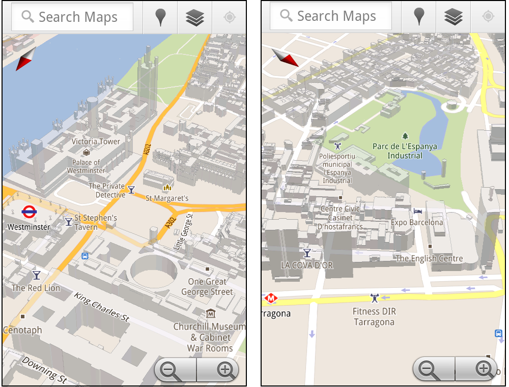
 Google have today added 3D buildings to Google Maps in more cities around the world. The new cities include London, Paris, Barcelona, Stockholm, Singapore, Lisbon, Boulder, and 11 major cities in South Africa.
In Google Maps the 3D buildings look pretty cool but they really only come to life on Google Maps for mobile. On Google Maps for mobile you can rotate, tilt, and zoom in and out on the buildings.

My guess is that at some point soon Google will look to implement the rotate and tilt views in Google Maps for the desktop.
The rotating buildings obviously make more sense on mobile maps where the orientation of the map can rotate to reflect your view. However this would be a great feature to be able to access via the Google Maps API. I could see this being a popular tool with many map developers.
Via: Google LatLong

Like many big cities Boston has very fluid neighborhood boundaries. Two people living next door to each other can often have very different ideas of which district they live in.
To try and clear up some of the confusion around Boston's boundaries Boston.com has created a Google Map that shows the different boundaries used by the Boston Redevelopment Authority, by the police, by the city and those determined by zip code.
Using the map you can drag the map pin around to view the different district boundaries at different locations.
Exploring Boston's Tangled Boundaries
Cooler Planet: Solar Energy Installation Map

Cooler Planet has created an animated time-line with Google Maps to show the progress of solar installations in California from 1999 through to 2011.
Using data from Go Solar California Statistics the map lets you view time-lines of 'total installs', 'total watts', 'watts per install' and 'total carbon saved'. It is fascinating using the map to view how solar power installations have blossomed in California over the last decade.
Google Maps now lets you search with 'descriptive terms'. Google describes 'descriptive terms as "the phrases which are most frequently used to describe ... places".
So, for example, if I want to find a pub that has quiz nights I can just type in 'quiz night' into the search bar on Google Maps. I will then be shown all the places that have 'quiz night' mentioned in reviews and other information gathered about the venue.

Other descriptive terms that I can imagine myself using a lot are 'great coffee', 'free wifi', 'free delivery' and 'live music'.
I'm sure I'll be using this new feature a lot!
Walking the Edit

Walking the Edit is an innovative iPhone app that allows you to create a mapped video. It is a great way to create a guided video walk or a video about your neighborhood.
Using the app you can take a walk through a neighborhood and the iPhone app tracks your progress and stores the location of the videos that you take on your journey. When you have finished your walk the app then creates a Google Map of your route with your synchronised video.
The videos are displayed on your automatically created map by small map markers. The size of the marker represents the duration of the video at that location. When you play the video the map view synchronises to the location of the video.
Sk8loc8

Sk8loc8 provides a searchable Google Map of over 1800 skateparks and skateshops around the world.
You can search the map by location and view nearby Skateparks, Recommended Parks, Skate Shops and Unconfirmed Skateparks. You can also click on the map to load nearby skating locations or to add the location of a missing skatepark.
Longboarding and Skateboarding Map

Here is a great map to help skateboarders find the best places to skate in their neighborhood. Edmonton longboard and skateboard shop Local 124 has created this worldwide Longboarding and Skateboarding Map of crowdsourced skating routes.
Anyone can add a route to this Google Map of skating spots and the map can be searched by location and by category. If you click on a map marker you can read details about the spot, rate it and leave comments.
A map sidebar lists the latest routes added to the map and it is also possible to view the locations of upcoming sessions and races on the map.
Toronto is Trending

Toronto is Trending has one of the coolest welcome screens I've ever seen on a website. When you go to Toronto is Trending you are presented with a full-screen video of Toronto. Twitter speech bubbles then appear above some of the moving pedestrians in the video and follow them down the street.
If you switch to the 'map view' you can then see the latest Tweets and check-ins made in Toronto on a Google Map view of the city. The map also displays a number of hotel, ticket and package deals.
The numbered map markers let you see how many people have checked into particular venues. You can select which category of venue you wish to see displayed on the map using the icons at the top of the map.
Altogether if you want to find the most happening venues in Toronto right now then you need to visit Toronto is Trending.
Toronto’s Most Dangerous Intersections

Global Toronto has mapped out Toronto's most dangerous intersections for pedestrians. By looking at the accident history data for 1337 intersections in the city Global Toronto has been able to identify which pose the most danger to pedestrians.
Global Toronto devised an 'accident ratio' for each intersection by combining two sets of data: accidents by intersection from 2000-09 and the average daily pedestrian head-counts at each intersection.
The Google Map shows in red the intersections that have the highest accident ratio.
Bangkok Traffic

Bangkok Traffic is a driving directions application for the Thai capital that also displays real-time traffic information.
To get driving directions you can drop two map markers on a Google Map or enter your starting point and destination into the search box. Your route is then displayed on the map and listed in the map sidebar.
Also displayed on the map is real-time traffic information, showing current traffic speeds on the city's roads. It is also possible to click on the webcam map markers to view real-time images from the city's traffic cams.