Bay Area Life Expectancy Map
If you live in Walnut Creek in Oakland you are likely to live 16 years longer than if you live in Sobrante Park. This glaring disparity is highlighted by the Oakland Tribune in its series of articles, and accompanying Google Map, looking at the life expectancy of people living in the Bay Area.
The map allows you to view life expectancy in Oakland and also view the neighborhoods' different cancer death rates, heart disease death rates and child asthma hospitalization. The red shaded areas on the map are the areas with the lowest life expectancy.
The map also includes links to articles and videos by the Oakland Tribune about people who live in the different Oakland neighborhoods.
Tuesday, August 31, 2010
Rent an iTowel with the help of Google Maps
SnapGoods
Soon there will be two kinds of people: those who use towels, and those who use iTowels. However forking out $299 on the latest GPS & Wi-Fi enabled iTowel may not be the life-changing moisture absorbing experience that it promises to be.
If like me you are always suckered in to buying the latest gadgets only to mostly end up disappointed and suffering from consumer fatigue then you should give SnapGoods a try. SnapGoods lets you borrow gadgets and gear from other SnapGoods members. It is a great way to try out a product for a small price before forking out half your annual salary on something that a few days later is consigned to the cupboard of broken promises and dreams.
SnapGoods is a website that facilitates the sharing and renting of stuff from SnapGoods members and local businesses. At the moment the site seems to be only operating in New York but has plans totake over the world expand to other areas.
SnapGoods uses Google Maps to show the location of stuff that is available to borrow. The map does all it needs to do; it displays goods for rent and it allows you to search for stuff by location. If you like the look of something on the map you can click through to get further details and to arrange a transaction.
Soon there will be two kinds of people: those who use towels, and those who use iTowels. However forking out $299 on the latest GPS & Wi-Fi enabled iTowel may not be the life-changing moisture absorbing experience that it promises to be.
If like me you are always suckered in to buying the latest gadgets only to mostly end up disappointed and suffering from consumer fatigue then you should give SnapGoods a try. SnapGoods lets you borrow gadgets and gear from other SnapGoods members. It is a great way to try out a product for a small price before forking out half your annual salary on something that a few days later is consigned to the cupboard of broken promises and dreams.
SnapGoods is a website that facilitates the sharing and renting of stuff from SnapGoods members and local businesses. At the moment the site seems to be only operating in New York but has plans to
SnapGoods uses Google Maps to show the location of stuff that is available to borrow. The map does all it needs to do; it displays goods for rent and it allows you to search for stuff by location. If you like the look of something on the map you can click through to get further details and to arrange a transaction.
The Future of Mobile Maps - Upnext
Today Upnext have launched their new iPad app with Fluid Labels.
http://techcrunch.com/2010/08/30/upnext-ipad-fluid/
Seamless integration with 3D Mapping, Map Overlays, real-time content.
The label system is now optimized for the iPad size. When you perform a search, multiple results populate the screen. As you move around the map, the results, smartly, refresh to give you more venues.
Category search or try using the Foursquare Friends checkins to really see the labels in action.
There are a couple more changes in this version. The Venue Info window has been enlarged and reformatted. Editorial and user reviews are now spread out in an elegant layout.
source:http://techcrunch.com/2010/08/30/upnext-ipad-fluid/
Gorgeous Map of the Week Award
Web 2.0 Summuit: Points of Control
A special one off Gorgeous Map of the Week Award has to go to this map produced for the Web 2.0 Summit. The map was produced following discussions between Tim O'Reilly and John Battele about the efforts being taken by the major "Internet companies to stake out points of control that will give them competitive advantage in the years to come".
John Battelle has provided a great description of what the map represents.
The map itself uses custom map tiles, custom map controls and custom map markers. All three have been beautifully realised and create a really effective overall design for the map.
The map also includes a great comment system. Users can click on the map and contribute to the discussion by using their Twitter log-ins. This is great way to effectively organise comment discussions spatially around particular areas of 'points of control'.
New York's Worst Landlords Mapped
NYC's Worst Landlords Watchlist
I wish this Google Map had been around when I was still renting. It is one of the best examples of open data I have seen, allowing New Yorkers to check if a landlord has housing code violations before renting.
New York's Public Advocate Bill de Blasio has launched a campaign, called Watchlist, to identify, track, and hold accountable New York City’s most irresponsible landlords. The campaign includes a searchable database and a Google Map of landlords' outstanding housing code violations identified by the New York City Department of Housing Preservation and Development.
Users can search the map by landlord name or by borough. Users can also use the map to report additional violations by a landlord or to report the resolving of a violation.
Tour of the proposed Belo Monte Dam Complex
Google has just released a very impressive tour showing the potential repercussions of the proposed Belo Monte Dam Complex on the Xingu River in the Amazon. The tour consists of a handful of 3D models, water animations, and a variety of other graphical elements to show the potential impact.
To be fair, Google makes it clear that they don't necessarily oppose the dam, stating on theirblog entry: "This is a complicated issue with many facets, and the views of this poster do not necessarily represent the official viewpoint of Google Inc.; we support the use of Google Earth for visualizations to create dialog."
Third World America on Google Maps
Third World America
The Huffington Post have created a Google Map to record the experiences of Americans hit by the current economic downturn. The map is obviously also being used as a bit of a marketing tool for Arianna Huffington's new book, 'Third World America'.
The map shows the areas hardest hit by home foreclosure, unemployment and bankruptcy. Users can also submit their own stories, pictures or video of how they have personally been affected by the financial crisis.
The map itself is a very simple My Map, which I can't help feeling is a bit of a shame. The map contains really important stories that need and deserve to be told. I just wish that the Huffington Post had taken a little more time and care with the presentation of these stories.
However I guess if anyone wanted to present this in a more elegant way they could just use the georss or the KML of the My Map.
Monday, August 30, 2010
First Google Map with Facebook Places
Nearby Friends
Nearby Friends is a Google Maps based Facebook application that utilises the new Facebook Places check-in facility. The application allows you to view all your friends check-ins on one Google Map.
Nearby Places doesn't just show your friends' latest check-ins it also allows you to visualise their entire check-in history. If you click on any of your friends' thumbnail pictures displayed on the Google Map you can choose an option to view their 'Check-in History'.
When you select to view the check-in history of a friend you are presented with a Google Map showing all their check-ins. Each check-in is represented by a profile picture. The larger the picture the more recent the check-in. Each individual check-in is also connected to the next check-in with a polyline. Therefore you can click on the largest profile picture and track your friend's check-ins backwards all the way to the womb (well maybe not that far).
Introducing our new YouTube channel for Google Mobile
By now, some of you may have noticed our new Google Mobile YouTube channel, with a fresh look that includes a video box that rotates along multiple axes (we love the Rubik’s Cube here at Google). As you click on and discover more videos, we hope you’ll have fun checking out all the ways the box can turn.
In our channel’s “featured” section, we highlight some of our mobile search capabilities -- like search by voice, sight, and location -- that really help you take advantage of your phone’s unique technology. Since we understand that these represent new modes of searching for many of you, we’re going to launch some new videos that help illustrate the variety of practical and fun ways that you can use these features. To start with, check out our “Shoot This” series of videos for Google Goggles. Goggles can actually recognize much more than just bar codes and book covers, and these videos really let you take Goggles for a test drive. You can navigate through these videos by clicking on the embedded annotations to fast-forward or rewind.
When looking at “all apps,” you can not only check out any of our latest videos at a glance, but also quickly sort them by mobile platform or by app.
We’ve also made it easier for you to share videos by email or through popular social networking sites.
We hope you enjoy trying out our new Google Mobile YouTube channel. We’ll be adding many more new videos, so please visit youtube.com/googlemobile and subscribe. Also, if you’ve already subscribed to our old channel, note that you need to subscribe to the new one separately.
Street View and The Wilderness Downtown
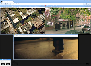
The music experience, called “The Wilderness Downtown,” was created by writer/directorChris Milk, with the band Arcade Fire and several of us at Google. Drawing upon Street View in the Google Maps API as well as features made possible by HTML5, we created what we hope is a unique and deeply personal experience of traveling
“The Wilderness Downtown” was made possible by recent developments in modern web technologies and modern browsers, and was built with Google Chrome in mind. As such, it’s best experienced in Chrome or an up-to-date HTML5-compliant browser.
You can launch the project and learn more about it on our Chrome Experiments site atwww.chromeexperiments.com/arcadefire. Enjoy the trip down memory lane!
A Google Maps Based Music Video
The Wilderness Downtown
This impressive Google Chrome experiment combines video, Google Maps and Google Street View and choreographed multiple windows to help demonstrate what is possible with HTML5. The experiment is an interactive interpretation of Arcade Fire's song "We Used To Wait" and was built entirely with the latest open web technologies, including HTML5 video, audio, and canvas.
The Google Map tiles used in the experiment are rendered, zoomed, and rotated in a scripted 3D environment. Animated sprites are composited directly over Google Maps satellite and Street Views. The animated sprites include flocking birds and animated trees.
The Google Maps API is also used for fetching dynamic routes to user chosen destinations and checking Street View content at points along the route. With so much going on the experiment is very processor intensive. It took about ten minutes to load on my desktop but the wait was definitely worth it.
Hat-tip: Street View Funny
Murder Maps
MurderMap
The Murder Map project aims to create the first ever comprehensive picture of homicide in London. On its completion, the developers say it will contain details of every murder and manslaughter committed in London from the crimes of Jack the Ripper to the present day.
At the moment the map seems to show murders in the UK capital just for 2010. You can filter the results shown on the Google Map of homicides by murder weapon.
All Murders Washington DC 2005-2009
Burgersub.org have a number of Google Maps that visualise murders in Washington DC and Baltimore. The maps include this Google Map of all Washington DC murders from 2005 and 2009.
Baltimore Sun - Baltimore Homicides
The Baltimore Sun has a Homicides Map that allows you to view all murders in Baltimore since 2007. The map allows you to refine the results by date, location, gender, race and cause of death.
New Orleans Murder Map
Shows homicides in the city in 2009.
LA Times Homicide Report
The LA Times uses Google Maps to show murders in Los Angeles. You can search the map by year, address or by name.
New York Times Homicide Map
The New York Times Homicide Map show murders in the Big Apple by year. The map includes a number of search options to refine the data by race, age, sex, murder weapon and locality.
Orlando-Area Murder Map 2010
This map from the Orlando Sentinel shows the locations of homicides committed this year.
Homicides in San Francisco 2007-2009
Google Map of San Francisco murders from the San Francisco Chronicle.
Birmingham, Alabama Murder Map
2009 murders in Birmingham visualised on Google Maps.
Drab i Danmark 2010
This map uses the SIMILE time-line with Google Maps to show murders in Denmark.
Hurricane Katrina, Five Years Later
Yesterday marked the five-year anniversary of Hurricane Katrina making landfall in New Orleans, Louisiana, causing over $80 billion in damage and killing nearly 2,000 people. Google Earth Blog offered a great deal of coverage to the event, as Google was able to contribute a variety of imagery updates and other resources to help. I had just started running Google Earth Hacks at that time, and users submitted quite a few KML files related to the hurricane.
Despite only being on the market as "Google Earth" for a few months (it was previously available as "Keyhole", though it was far less popular) many people, such as this couple, were able to use Google's oft-updated imagery of the area to see the condition of their home.
In early 2007, after having posted post-Katrina imagery in Google Earth, they reverted the default layer to pre-Katrina imagery. While this was only done to insure the highest quality imagery, Google caught a lot of flack for this and resolved it a few days later.
Late last week, Google posted a short entry that recognized the anniversary of Katrina. As they mention in the article, Google Earth's historical imagery tool is a great way to look back and see how the city changed from pre-Katrina, after the storm hit, and how it looks today.
Escalator Down at Metro Station
TBD.com: Map of WMATA Problems
TBD.com have used the Ushahidi Google Maps reporting system to create a map of Washington Metropolitan Area Transit Authority problems. The map allows TBD.com's readers to see at a glance where there are current problems on Washiongton's transit system.
Using Ushahidi's reporting system allows TBD.com to crowdsource current problems on the WMATA. Users are able to report problems by directly submitting a report, tweeting an alert with hashtag #tbdwmata or by emailing an alert.
Submitted problems on WMATA will automatically appear on the Google Map. The reports are also listed under the map in chronological order.
Sunday, August 29, 2010
New Orleans Mapped: Post Katrina
Five years ago New Orleans was devastated by floods caused by Hurricane Katrina. It was one of America's worst ever natural disasters.
Whilst some areas, such as the French Quarter have recovered and other areas are being rebuilt, some areas, like the New Orleans East area are still almost completely abandoned. The New Orleans East area used to have a population of more than 100,000 it now has a population of around 7,000.
Back in 2005 Nova created a New Orleans Flood Map that allows you to view an overlay of the flood over your home town. The map now looks very basic but it is still an effective way to visualise the sheer scope of the floods.
If you zoom in on your part of the U.S. you can see the overlay superimposed on your home. The blue overlay only shows flooding in New Orleans proper. Additional flooding occurred in other suburbs.
New Orleans Repopulation Map
162,115 households received mail in June 2010, in New Orleans, compared to 203,457 in June 2005. The U.S. Census Bureau's methods for estimating population can't keep up with the extraordinary situation post-Katrina so looking at residential addresses actively receiving mail is one way that population can be estimated.
This map from the Greater New Orleans Community Data Center shows residential addresses actively receiving mail by census block in New Orleans. The mailing list data represents the number of residential addresses per block where the mailman knows someone picks up the mail.
The map shows the population density in June 2010, the darker the shade the higher the density. If you zoom in on a block you can see the June 2005 households compared to the most recent figures.
New Orleans Redevelopment Authority
The New Orleans Redevelopment Authority are using Google Maps to help show the condition of properties in New Orleans.
The Authority's Project Search lets you search for projects and current Requests for Proposals in its database. If you search for a New Orleans neighborhood you are presented with a list of properties. If you click on the 'more details' link next to a property you can view photographs of the property and view its location on a static Google Map.
World Wide Store Locator on Google Maps
Vitra
The Swiss furniture manufacturer Vitra has a global dealer network so it is important that customers around the world can quickly find the dealer that is best for them. Vitra has therefore used Google Maps to create a store locator service to enable customers to find their local Vitra dealer.
It is possible to search the map for a Vitra dealer by entering a street, city or zip code. It is also possible to refine the results displayed on the map by type of Vitra dealer. If you click on a dealer's map marker you can get the dealer's full address, a breakdown of Vitra products offered and driving directions.
The Vitra Google Map was developed with the Weisso Pinpoint location finder.
More Open Government with Google Maps
Iconomical is a web design company that specialises in data visualisation. The company have produced two excellent Google Maps to help visualise UK Government data.
Research Funding Explorer
The UK's Department for Business Innovation and Skill has produced a great Google Maps time-line to show research funding in the country over the last ten years.
If you press play on the time-line (below the map) you can view an animated visualisation of where in the UK investment has been made. As the animation plays a heat map is generated on the Google Map and a bar chart besides the map is also animated.
London Gazette - Pollution Prevention & Control
The London Gazette is the UK's official newspaper of record for recording and disseminating official, regulatory and legal information. Iconomical have produced a data visualisation tool that lets users browse the paper's Pollution Prevention & Control notices.
The visualisation shows all notices for 2008 and 2009. The papers are shown stacked in a time-line beside a Google Map. When you select a paper from the stack you can view the same notice on a Google Map to help find the location of applicants and where notices were issued.
Saturday, August 28, 2010
Go East!
The Google Earth and Maps Imagery team has just finished rolling out new imagery across the globe, including a significant amount of aerial imagery in Eastern Europe. It's been a while since we had a big update in that part of the world, and there are a ton of fantastic sights for all you armchair geographers out there to explore. Break out the Slavic dictionary, crank up the techno, and start zooming in!
High Resolution Aerial Updates:
USA: Pittsburgh, Kane County (IL)
Poland: Krakow, Tarnow, Nowy Sacz, Bielsko-Biala, Zory, Chorzow, Krosno, Kolbuszowa, Chorzow, Czestochowa, Kielce, Radomsko, Belchatow, Skarzysko-Kamienna, Kielce, Starachowice, Radom, Ostrowiec, Pulawy, Zamosc, Jelenia Gora, Swidnica, Glogow,
Czech Republic: Vysocina, Jihomoravsky, Olomoucky, Moravskoslezsky
Macedonia: entire country
Countries receiving High Resolution Satellite Updates:
Cuba, El Salvador, Costa Rica, Colombia, Venezuela, Peru, Brazil, Bolivia, Argentina, Chile, Uruguay, Morocco, Algeria, Egypt, Senegal, Mali, Guinea, Ivory Coast, Ghana, Murkina Faso, Nigeria, Benin, Chad, Cameroon, Central African Republic, Sudan, Ethiopia, Somalia, Kenya, Tanzania, Zimbabwe, Zambia, Angola, Botswana, South Africa, Madagascar, Saudi Arabia, Oman, Kuwait, Jordan, Israel, Russia, Estonia, Latvia, Lithuania, Hungary, Slovenia, Bulgaria, Iran, Pakistan, India, China, Myanmar, Cambodia, Indonesia, Australia, New Zealand, The Philippines, Japan, North Korea, Mongolia
Countries receiving Medium Resolution Satellite Updates:
Myanmar
These updates are currently only available in Google Earth, but they'll also be in Google Maps soon. To get a complete picture of where we updated imagery, download this KML for viewing in Google Earth.
Google Maps Bike Route Reporting System
Meldsysteem Bewegwijzering Fietsroutenetwerken
This Google Maps Mashup wins the Longest Name of the Year Award. Luckily it also qualifies for the award for most useful Google Maps Mashup for Dutch Cyclists.
Meldsysteem Bewegwijzering Fietsroutenetwerken is a Google Maps based system for reporting problems on bicycle routes in the Netherlands. The map uses shape files from the Landelijk Fietsplaform (National Bicycle Platform) to automatically determine where a report should be sent. When a user makes a report the right maintenance authority will get the report. The authority can also use the system to report when/if the reported problem will be fixed.
It is possible for any website or blog to embed the system using an embeddable widget.
The reporting system was created using GeoStart a product of SWIS.
Subscribe to:
Posts (Atom)