Tuesday, August 10, 2010

Crowd Sourced Crisis Mapping 2.0

Crowdmap
Ushahidi Map
Ushahidi's first incident reporting map of human rights abuses in Kenya

Since 2008 Ushahidi have been creating crowd sourced maps to document and report human rights abuses, election abuse and to provide crisis maps. At the heart of Ushahidi's platform is the mapping of crowd sourced incident reports provided by eye witnesses. One reason that Ushahidi maps have been so successful is that the platform allows for the submission of witness reports by SMS text, by e-mail or by web forms.

This ease of incident reporting has led to Ushahidi being used to map the political crisis in Madagascar, the spread of swine flu, the Chile earthquakeand the Haiti earthquake, to name but a few (there are three pages of results for a Google search of Ushaidi on Google Maps Mania).

Now Ushahidi have released Crowdmap to make it easier for anyone to set up their own crisis map. Ushahidi claims that it "takes all of five minutes to get a vanilla deployment up and running on crowdmap subdomain." Once you have established your Crowdmap domain you have full administrative access, just as you would if you installed it yourself. You have the ability to choose themes, edit categories and solicit reports.

Obviously Ushahidi are hoping that by creating a platform that requires little technical acumen and that can be implemented at speed that they are bringing the ability to create incident reporting maps to those most in need, on the ground.

Monday, August 9, 2010

WikiLeaks War Logs Mapped - Part Four

Ekstra Bladet - Warlogs

Danish newspaper Ekstra Bladet, who have already mapped all the WikiLeaks Afghanistan warlogs involving the Danish army, have now mapped all 75,000 entries.

This Google Map uses the Maptimize marker clustering solution to map so many markers. Approximately 500 reports from the WikiLeaks documents do not contain geographic data so they obviously don't appear on the map.

Also See

_____________

What's Happening in Manhattan?

Nitefly

Nitefly promises to find you the best drink deals, parties and events happening right now in Manhattan. To find a happening night spot with Nitefly all you have to do is type in a location and Nitefly will show you a Google Map of the best venues near by.

If you click on one of the returned venue map markers Nitefly will show you the best tips from Foursquare, gauge the buzz at the venue with real time Twitter updates and even show you who is attending events here with Facebook.

For each venue Nitefly also returns its Yelp user rating score and gives you the venue's full address and telephone number.

The Tempe Town Lake Drain

The NASA Earth Observatory captures a lot of amazing images of our planet, and their Image of the Day highlights a particularly interesting image each day.
Their most recent imagery is of Tempe Town Lake in Scottsdale, Arizona. On July 20, the rubberized dam on the west end of the lake ruptured and sent 977 million gallons of water down the Salt River.
The imagery they released isn't quite as sharp as the default imagery in Google Earth, but it still shows the massive decrease in the size of Tempe Town Lake.
tempe_town_lake_comparison.jpg
If you want to see it for yourself, you have a few options. First, you could simply view a jpg image of the July 28 imagery. You could also download that imagery as an image overlay (KMZ) that I created from the July 28 imagery.
If you don't follow it already, I highly recommend you follow NASA's Image of the Day; they show off a lot of great stuff!

Google Map of Journalist Deaths 2010

Mapping Journalists Killed in the Line of Duty

Mibazaar has created this Google Map to commemorate the lives of journalists lost in the line of duty this year. The map is based on data from CPJ.org.

Each marker shows a location where a journalist has been killed this year. If you click on a marker an information window opens with the details of the journalist killed. Each information window also includes back and forward buttons so you can quickly navigate to the next journalist in the map sidebar.

Pomona College on Google Maps

Pomona College Tour

This nicely designed campus map of Pomona College in Los Angeles shows the location of campus buidlings, halls of residence and campus services. 

The map includes photographs of some of the buildings and even includes historical information about some of the more interesting buildings on campus. Those venues on the university that have Gowalla and foursquare entries even contain links to read users' tips.

The map markers are color-coded and the categories of marker can be selected from the menu at the top of the map.

WSJ goes the distance with the Google Maps API


The following guest blog post was written by Albert Sun of the Wall Street Journal. He takes us behind the scenes in the creation of a recent news graphic titled: "Going the Distance: Comparing Marathons".

The Google Maps API has been a great boon for news websites and a great help in creating all kinds of interactive graphics involving maps. Here at the WSJ we're big fans of the API and happy that Google continues to improve it and roll out new features.

 We got the idea to map out the routes of Marathons from a story by Kevin Helliker about how despite the beautiful scenic route of the race, the San Francisco marathon was still very unpopular. The difficulty and the hilly terrain kept people from attempting it. To help people see this better, we decided to compare the San Francisco marathon to the big three US marathons: Boston, New York and Chicago.

The code for our marathons graphic grew out of a similar graphic we did for our coverage of the Tour De France. In this one, we managed to incorporate many improvements. Two new features of the Google Maps API played a big role in this graphic. The Elevation API let us quickly and easily get a comparison between the different routes.

Styled Maps let us give the map more of a distinctive WSJ look. We have a distinctive style for our maps in print, and there is some reluctance to run maps online that deviate from that style. Styled Maps lets us get close enough for what we're trying to show. When Styled Maps first becomes available we used the Styled Map Wizard to create a set of different looks for different types of maps, trying to recreate our own maps style.

Along with the Google Maps API, we used jQuery for its wealth of convenience functions and how much easier it makes writing programs in JavaScript. The core of the graphic is a basic Polyline drawn in Google Maps showing the route.

If your path is simple enough, (fewer than 300 or so points) you can take that and directly request elevations along it using an ElevationService object. The elevations are handily returned at equidistant intervals along the path. If a path is more complicated than that, like ours were, you can either break it up into multiple requests, or send a simpler path. We decided to pre-simplify the paths with a Ramer-Douglas-Peucker algorithm (a very useful algorithm for GIS applications) and sent the simplified path off to get elevations.

Taking the array of elevations returned by the API, we used Flot (http://code.google.com/p/flot/) to draw a chart. The result of an Elevation API request retains the LatLng points and elevation for each point along the path in order, so from there it was easy enough to detect the x position of the mouse over the chart and use that as an index for the array of results.

This worked at first, until we noticed that in places where the marathon route was going over bridges, the elevation API was returning negative values. As it turns out, if given a point over water, the elevation API will return the depth of the sea bed. That might be useful for some applications, but was clearly unsuitable for this map. We ended up saving the results from the elevation API and splicing in the elevations of bridges by hand, an inelegant solution, but manageable since we were only doing four paths.

Now, the final feature was Street View, and it really surprised me how easily Street View could be integrated. After registering a Street View panorama object and assigning it a div, it's literally as simple as passing it a LatLng to place the pegman on the map. Because the Street View API responds super speedily to requests, it can mostly keep up with the rapid fire requests from dragging the mouse across the chart.

As newspapers' Web sites continue to draw a larger and larger share of overall readership, its important to keep moving forward in finding and creating great tools for making informative and beautiful graphics.

So, thanks Google for creating such a useful API!

Sunday, August 8, 2010

Buenos Aires in Panorama

Foto Recorridos

Foto Recorridos is a collection of 360 degree panoramic photos of Buenos Aires, Argentina. The site uses Google Maps to show the locations of all the interactive panoramas of the city.

The panoramas contain links that allow you to navigate from one image to another. You can also click on the map markers to load the panorama for that location. As you navigate from one interactive image to another a green line is drawn on the map to connect the panoramas. This feature allows the viewer to tell at a glance which photographs have already been viewed.

Other Panoramic Photograph Maps

Search for Travel Books with Google Maps

JungleThingy

JungleThingy is a very simple to use Google Maps based search engine for travel guides listed on Amazon.

To search for a travel book for a specific location on JungleThingy just click on a location on Google Maps. The travel guides and travel books for that location are then listed in the middle column. If you then click on one of the listed books you can get further details, including the price, reader ratings and a summary of the book's contents.

Also See

GuidebookPlus - maps the page numbers of locations in guide books, such as those published by Lonely Planet and Rough Guide.
Labels: 

Animated Google Sky

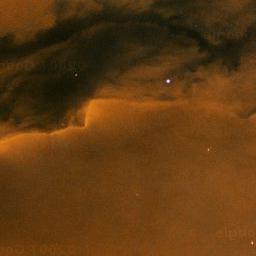
Eagle Nebula Scroll

Having played around with static Street View images to create an animated side view of Oxford Street in London I wondered if it was possible to do something similar with static map tiles fromGoogle Sky.

It is.

Here's an animated marquee of the Eagle Nebula. In itself it probably doesn't have many practical applications but the static images could be useful for anyone wanting to illustrate an astronomy article on the internet.

The image illustrating this post is itself a static Google Sky map tile.

Perhaps Google should create a static API for Google Sky as they have forGoogle Maps.